One major project over the past two years involved achieving logo compliance within HCLSoftware’s product lineup. With the acquisition of products from IBM, each came with its own distinct logo, resulting in a lack of visual cohesion.
To remedy this, I worked with a colleague developing comprehensive branding guidelines and implemented them to achieve compliance without altering the legacy logos. Additionally, we created several new logos in line with these guidelines.
Logo for HCL iAscend training Academy
HCLSoftware
One of the projects involved designing the logo for the internal training Academy—a vital resource for both employees and business partners. The essence of this logo lies in its ability to cleverly intertwine the letters “i” and “A,” symbolizing unity and collective progress, while hinting at the concept of growth.
The choice of an orange color palette was intentional, serving to set the Academy apart while maintaining brand cohesion within the organization’s visual identity.
Branding
R-Evolution
One of my standout projects as an individual contributor involved creating the concept and the brand of R-Evolution, a prestigious private studio offering private training and osteopathic, physiotherapeutic, and dietary services.
Before beginning the designs, I conducted extensive user research, and built a strategic communications and marketing plan. For more details, please refer to the full case study.
I crafted a main logo along with several sub-logos, each representing their core services with unique colors and taglines.
In addition to the logo designs, I crafted anextensive amount of collaterals for R-Evolution.
This included designing business cards, gift cards and publications utilized during post-graduate trainings, as well as other marketing materials.
For a glimpse into further designs, feel free to explore the “Decorations & apparel” section, where you will find my designs, ranging from t-shirts to gadgets and other decorations.
YouTube Channel
R-Evolution
I took the initiative to establish a dedicated YouTube channel for the client, where I edited and published over 100 videos.
These videos showcase the studio’s array of services and feature an entire series of tutorials demonstrating exercise techniques.
The tutorials have proven to be invaluable to the client, serving as integral components in their training programs designed for individuals to follow at home.
These programs are often combined with personalized training sessions and diverse treatment modalities offered by the studio.
This channel proved to be a key element of the business strategy we put in place during the long Covid lockdown in 2020.
Frank Spillers’ Inner Circle serves as a learning platform tailored for UX Professionals.
In 2021, I crafted their brand identity, including a logo and a range of accompanying collaterals, establishing a robust brand identity that continues to resonate.
Logo and corporate image
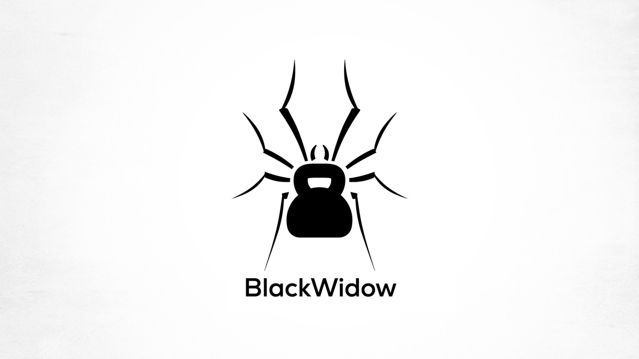
BlackWidow
Black Widow emerges as a premier private training studio nestled in the heart of Rome, commencing its operations in 2019.
I created the complete visual identity, including designing the logo.
The challenge was to incorporate a black widow spider—a symbol that can evoke negative connotations for many—while infusing relevance to fitness. To achieve this, I ingeniously replaced the spider’s body with a kettlebell, striking a harmonious balance between strength and symbolism.
Furthermore, I curated the interior aesthetics of the studio, seamlessly blending functionality with style. For a closer look at some of my designs, explore the “Decorations & apparel” section.
I’ve had the pleasure of designing private labels for several esteemed wine producers, enhancing their brand presence and identity in the market.
Additionally, I crafted a charming Christmas greetings card for one of their international resellers, infusing warmth and holiday cheer into their seasonal communications.
Branding
Workshop Active Leisure
In 2019, Workshop Active Leisure launched its first edition aiming at advocating tourism in various regions of Italy, inviting visitors to partake in active holidays such as hiking or bike tours, coupled with moments of relaxation, such as beach getaways.
Entrusted with crafting the event’s logo, the challenge was to encapsulate the diverse opportunities it offered. The logo, utilized across both print and digital platforms during the event, ingeniously hinted at these varied experiences.
While the initial plan was to host the event annually, the unfortunate outbreak of Covid thwarted these plans.
Visual identity across touchpoints
Alli by Itadilux
The Alli Event was conceived to serve Italian luxury travel professionals, offering a platform for presenting their premier offerings to top international buyers. Before initiating the design process, I conducted thorough user research and developed various design and marketing studies (see case study).
In managing the event’s visual identity, I crafted a comprehensive style guide capturing the essence of luxury travel. This included designing wireframes for the website and producing brochures for editions hosted in Venice and Rome.
Furthermore, I meticulously curated event decorations, harmonizing aesthetics with functionality to evoke the ambiance expected in the luxury travel industry. Delve into the “Decorations and gadgets” section for a detailed showcase of my design contributions.
For Meeting Line, a conference organizer primarily focused on the medical field, I led the effort to revamp their branding and communication approach. Introducing a unique concept, I paired famous quotes with unconventional imagery, injecting a fresh perspective into their typically serious domain.
This innovative approach proved highly successful, substantially broadening Meeting Line’s client base and enhancing their market impact.
Travel brochure Japan
Miki Travel
Miki Travel, a travel organizer with Japanese ownership and a branch office in Rome catering to Italian clientele, specializes in offering trips to Japan. Over the course of several years, I had the privilege of designing their travel brochure along with various other collaterals.
One such example is showcased here, highlighting the meticulous attention to detail and cultural sensitivity infused into each project.
Branding
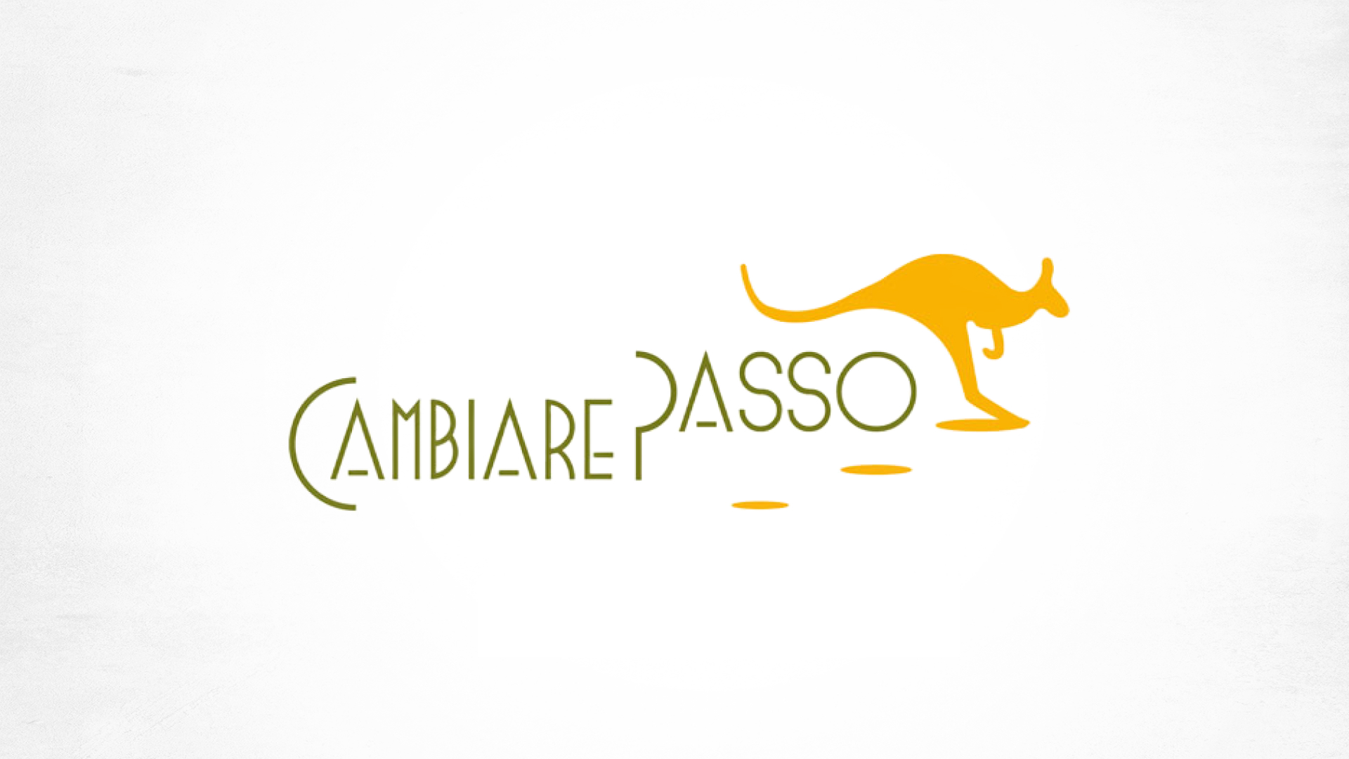
Cambiare Passo
Cambiare Passo is a collective of psychotherapists operating from a studio in Rome. The name “Cambiare passo,” translating to “change of pace” in Italian, embodies their mission of facilitating personal growth and transformation.
In response to their request, I crafted a logo that not only symbolizes growth but also embodies the notion of embarking on a new and different journey, aligning perfectly with their vision.
Logo design
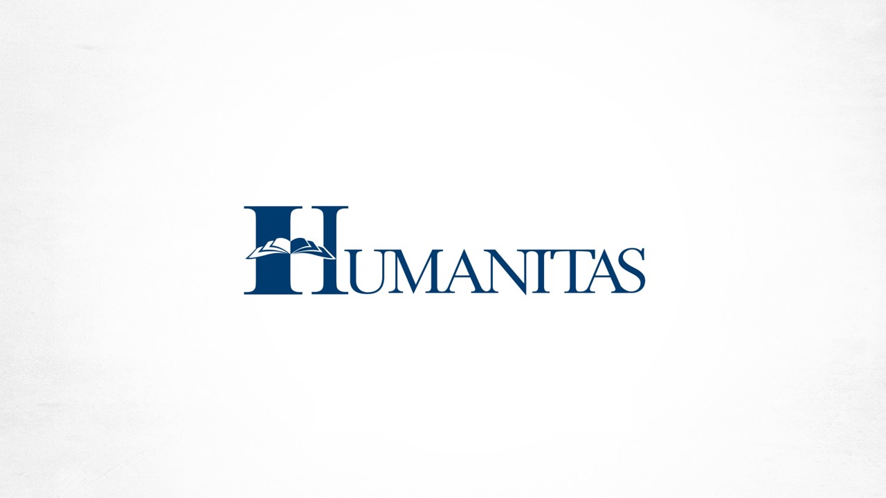
Humanitas
Humanitas, a distinguished post-graduate school located in the Vatican City, catering to psychology graduates, boasts a rich legacy of academic excellence.
Tasked with creating a logo that honors both their academic pursuits and longstanding tradition, I meticulously crafted a design that embodies the essence of scholarly pursuit while paying homage to their prestigous history.
Logo design
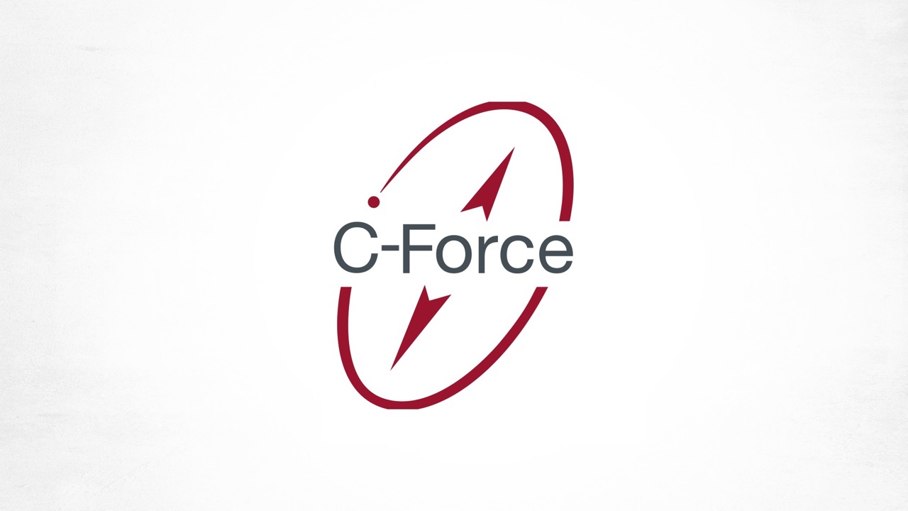
C-Force
C-Force, a prominent Danish firm specializing in accounting services, sought a logo that would convey a sense of direction and comprehensive, all-encompassing service.
In response, I crafted a design that encapsulates the notion of guidance and offers a holistic approach, symbolizing their commitment to providing 360° assistance to their clients.
Logo design
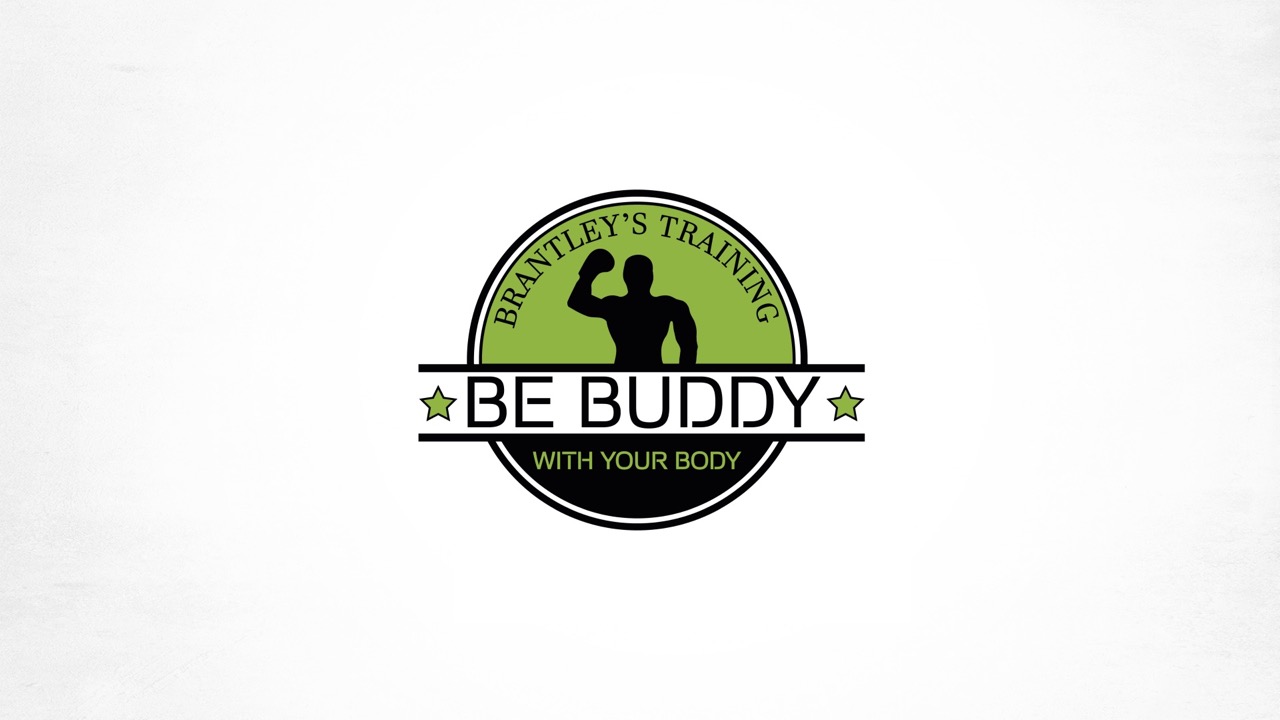
Be Budddy with your Body
Be Buddy with your Body, a private training studio situated in Denmark, specializes in boxing and personalized training programs.
The unique challenge presented was accommodating the lengthy company name along with the owner’s personal name within the logo design.
I crafted a visually appealing and cohesive logo that seamlessly integrates both elements, effectively capturing the essence of the studio’s ethos and the personal touch of its owner.
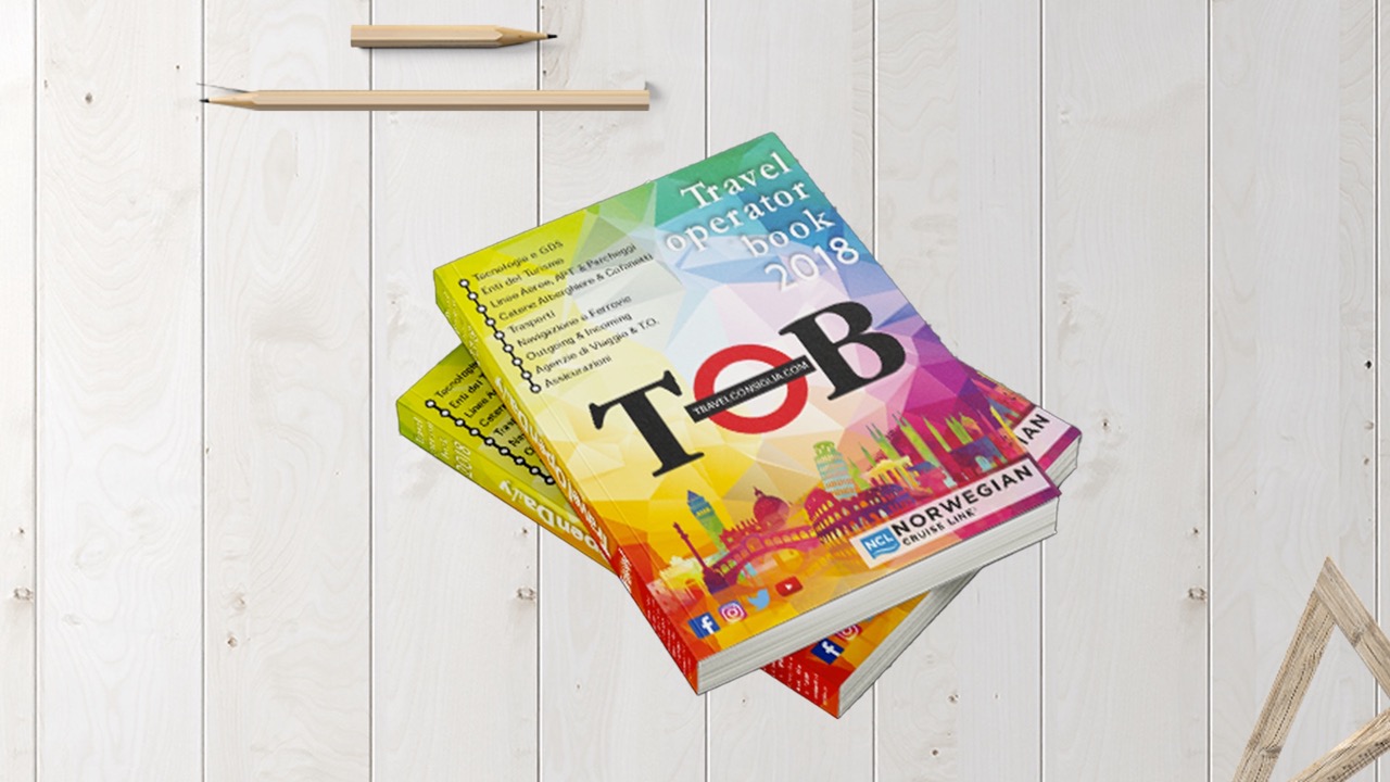
Guide for Italian travel professionals
Travel Operator Book
The Travel Operator Book was an indispensable guide for Italian travel professionals before widespread internet usage. It provided vital contact details for major airlines, tour operators, and travel agencies across Italy.
I designed its cover for the final edition and created event collaterals for its launch, enhancing the overall success of this last special edition.