Aligning customer-facing applications in HCLSoftware
Overview
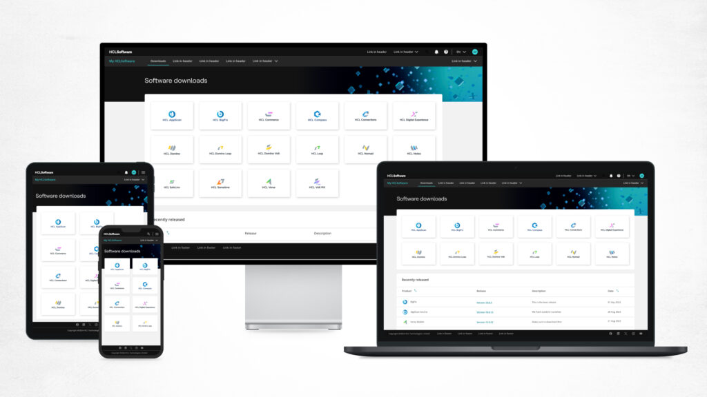
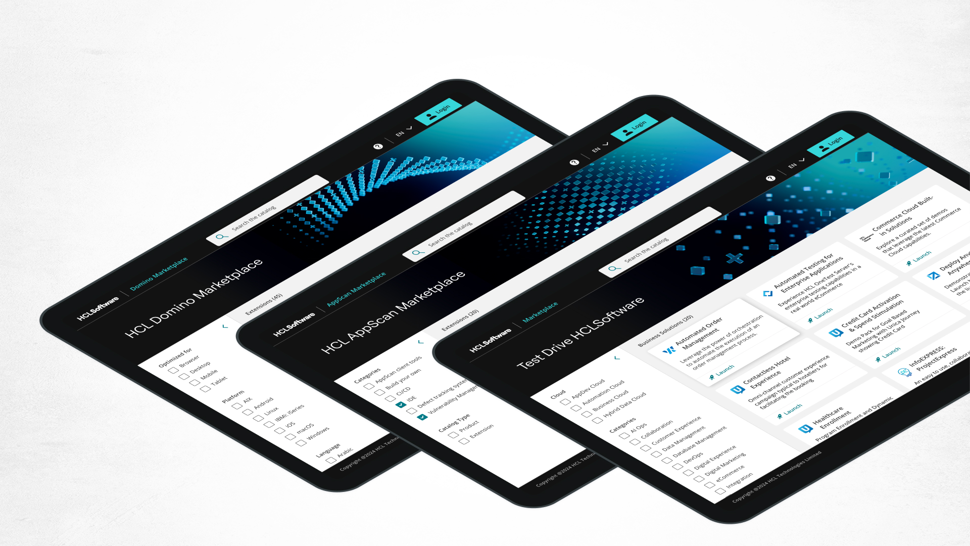
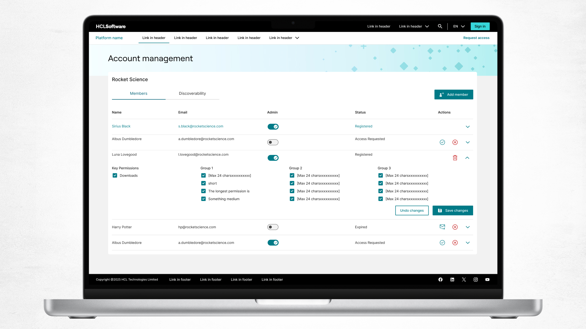
The project is aimed at aligning two key customer-facing portals and creating a set of designs and standards that would not only create a consistent experience between these portals, but serve as the basis for integrating a variety of additional portals.
On release, these portals doubled user satisfaction, saved the company 2+ million dollars, and created 10s of millions of dollars in pipeline.
Goals
Aligning experience.
Easier to navigate.
Meet international accessibility requirements.
Reduce costs of external portals.
Reduce costs of design and development.
Build standards replicable for other external portals such as documentation.
When
2022 – ongoing
Company & team
Applications are property of HCLSoftware 2025
Team:
Aaron Bauer – UX CoE
Isabella Minzly – UX CoE
Katie Rossi – UX Cloud Engineering
Customer journey map for two key portals
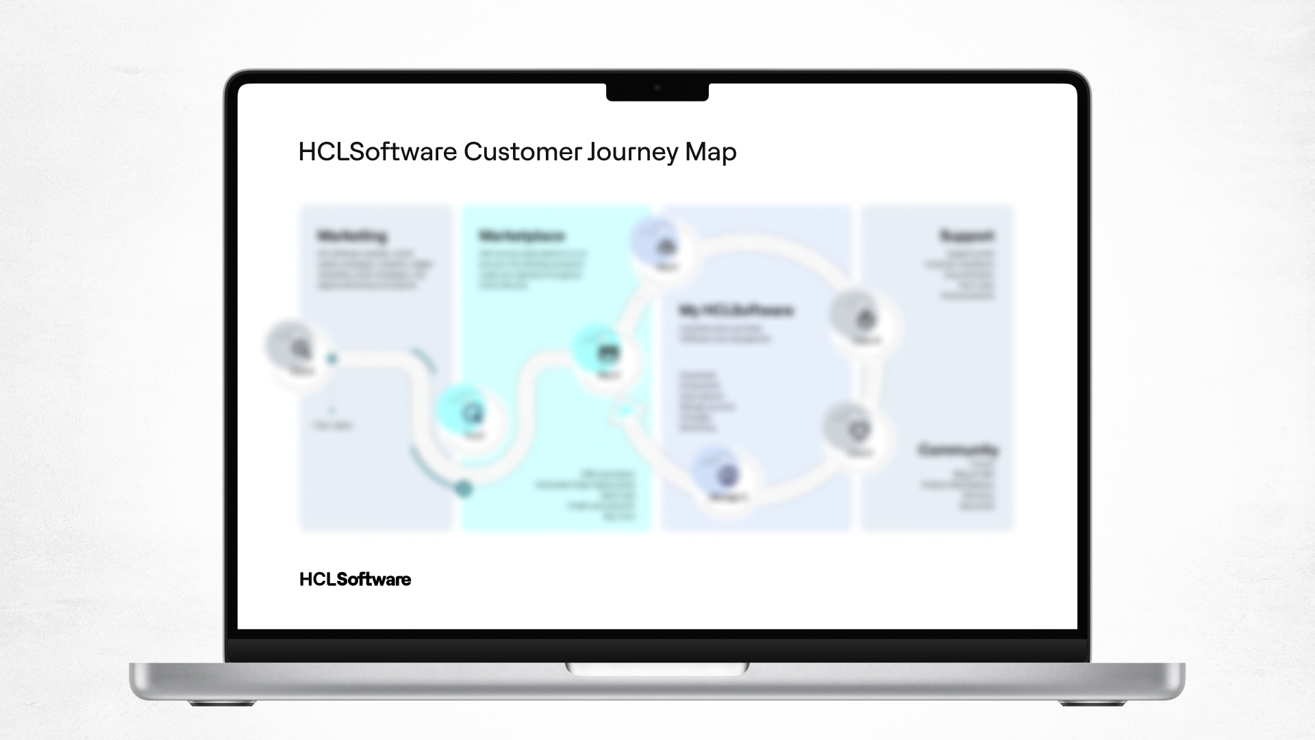
The Customer journey map aligns our teams and HCLSoftware as a whole around a common vision of how a customer engages with HCLSoftware and the resources we provide to make them successful at each stage. It helps drive everything from leadership conversations around direction to project team decisions around UI direction.
Marketplace
Enable customers to discover, try and buy HCLSoftware products. This is our strategic SaaS sales platform.
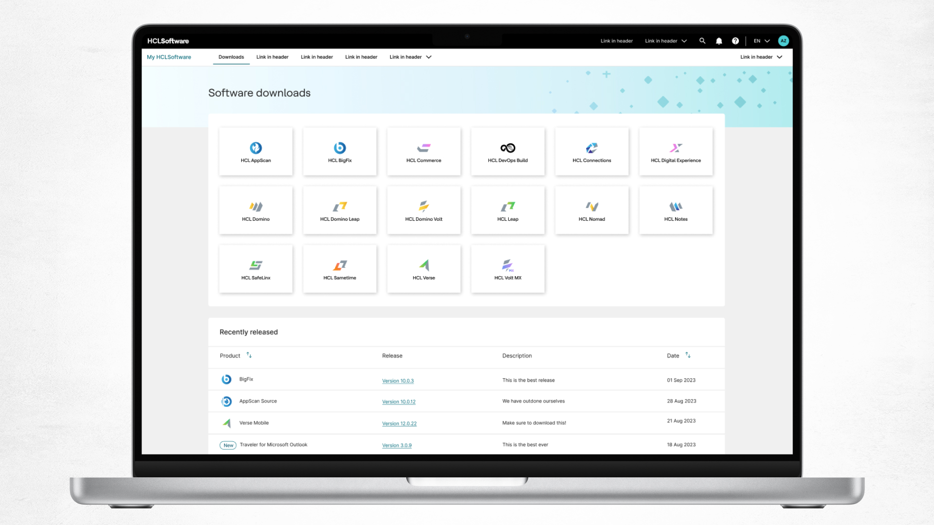
My HCLSoftware
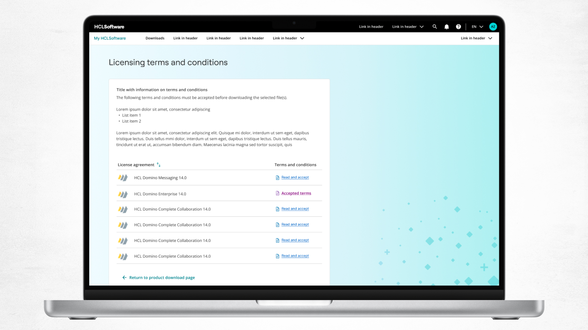
Where customers go to manage their HCLSoftware purchases. Self-service portal to view and manage accounts, relationships, assets, and services.
Challenges
Seamlessly integrate two distinct systems targeted at different user sets and leveraging different technologies and standards.
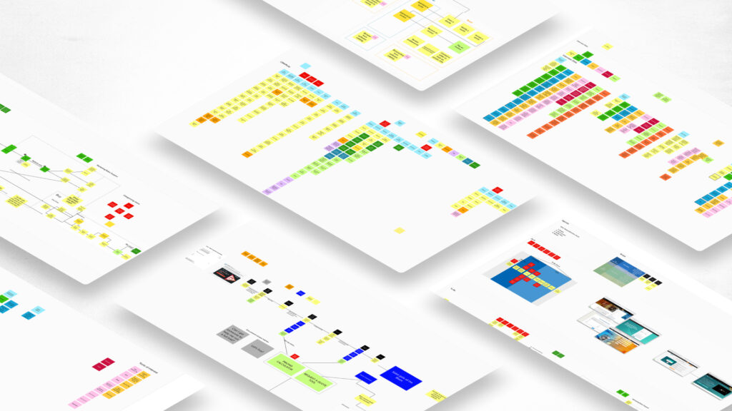
Information architecture must support products with different organization and terminology.
Stakeholders cross most internal and customer segments.
Many designs involved creating templates for future unknown requirements.
Capturing prospect leads throughout the entire journey.
Design research
Our services target a variety of users and flows, and we have conducted diverse research intended to ensure our designs accommodate our audiences’ needs.
This work ranges from formative customer interviews identifying target personas and existing pain points, to structured internal reviews to inform dynamic information architectures, to the design of a beta intended to both evaluate the existing designs and prioritize future work.
Design language/libraries
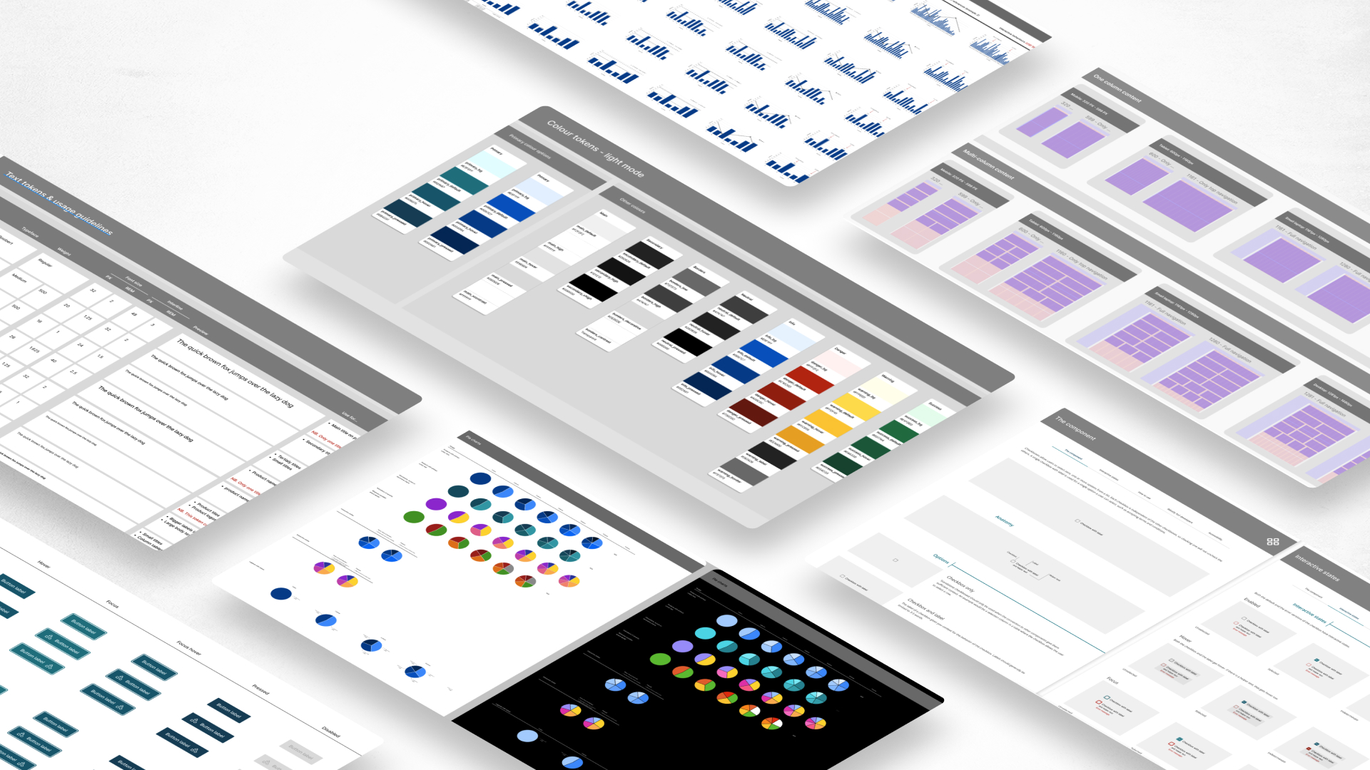
Our goal was to create a design language that not only aligned the portals visually, but was fully accessible (WCAG 2.2 AA compliant), and included a large set of components that solved common design problems in a clear and intuitive way.
Designers from various product teams are leveraging our design language, our components, our templates and patterns, and our definitions of responsive behaviour. This helps them facilitate the design process, as well as making sure basic accessibility requirements are getting implemented correctly and efficiently.
Corporate branding
At the same time we were beginning to work on aligning our portals, our marketing organization was in the process of rebranding. While their work did not have specific guidance for our project, it did include both general visual guidelines and meaningful graphical elements that we wanted to integrate into our process, so that our portals would reinforce our corporate brand.
Updated branding
After 2 years, we were asked to accommodate new corporate branding.
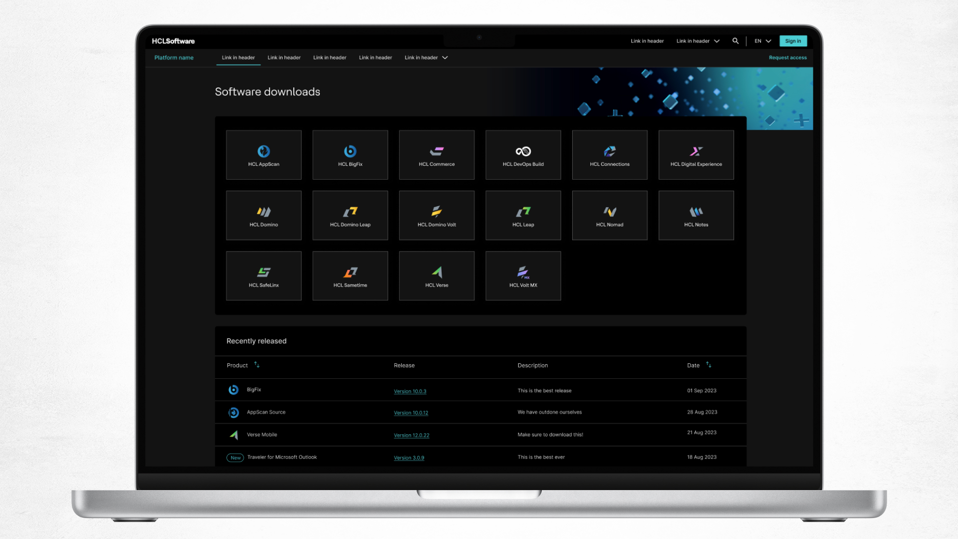
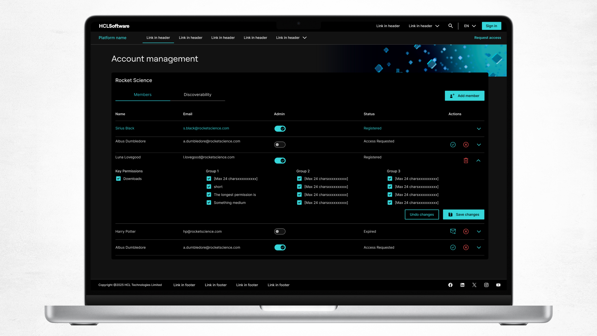
The way we had structured our design system facilitated adoption of new colour systems. We initiated a process of integrating as many elements as we could without compromising key values such as accessibility and usability, then working with the marketing team on the parameters of adoption.
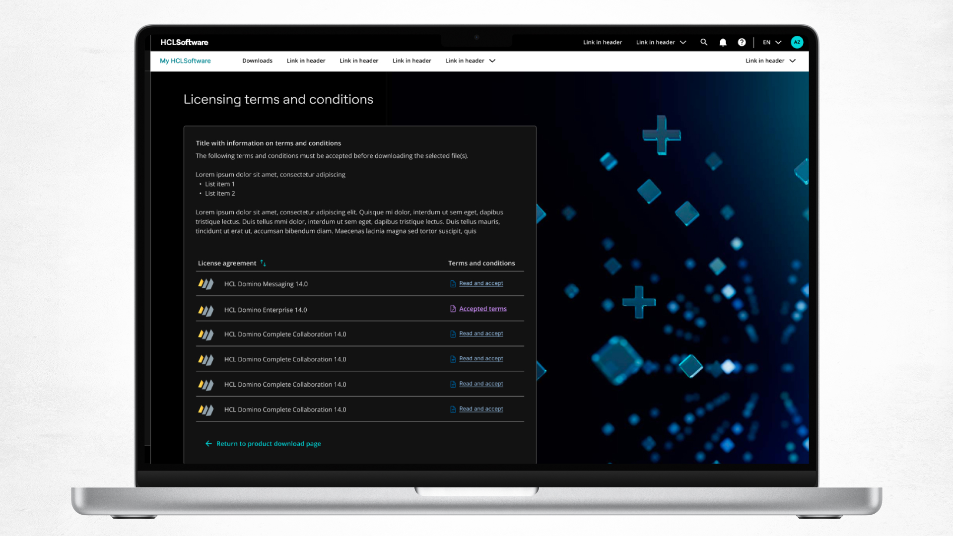
The process had the happy benefit of enabling us to more clearly distinguish our light and dark modes.
Navigation
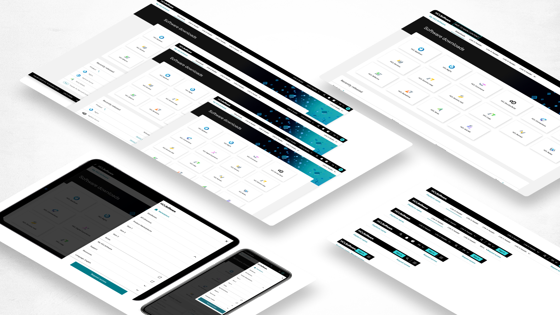
HCLSoftware customer facing sites are implemented by independent groups and at best loosely connected visually and navigationally. We built a robust header system that let the user know they were at an HCLSoftware web page, facilitated easy navigation within and between portals, and would support the various needs of not only our portals but those of the portals we will be integrating over the upcoming years.
Accessibility
Building accessible digital products is the right and ethical thing to do, aside from being a legal requirement.
Being accessible will enable our products to sell to all customers both in the US and in Europe, including governmental institutions. We build accessibility into not only our design language and components, but into how we evaluate and deliver designs.
WCAG 2.2 AA Compliance
All our designs are WCAG 2.2 AA compliant, as per international legal requirements.
Accessible deliverables
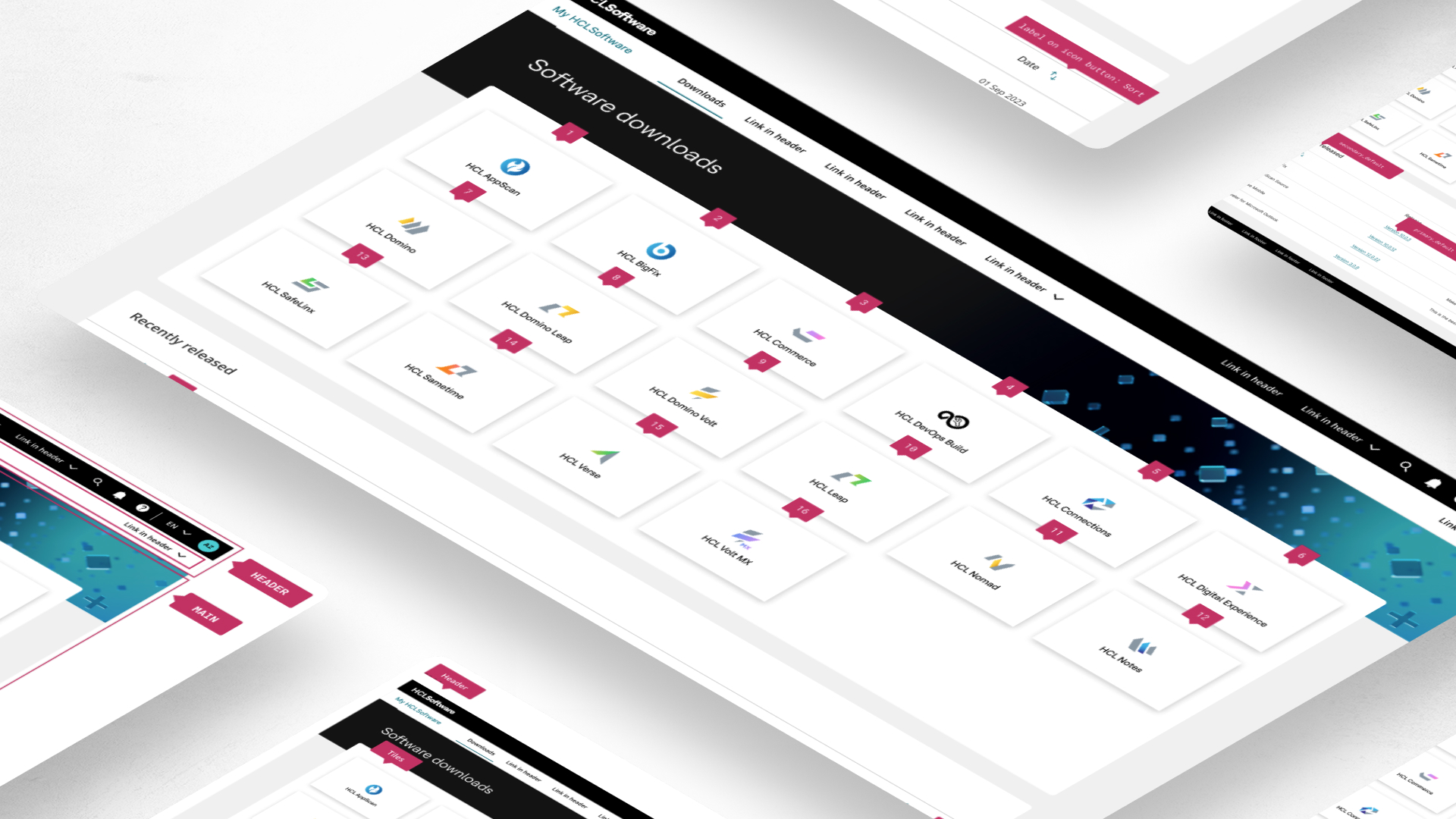
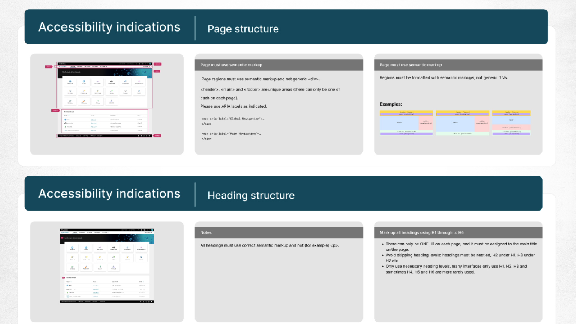
When handing off designs to development, we give full indications of accessibility requirements:
Page regions
Keyboard navigation order
ALT text on images
Labels on icon buttons
Heading hierarchy
Components usage, with assigned interactive behaviour
(And much more)
Fully responsive designs
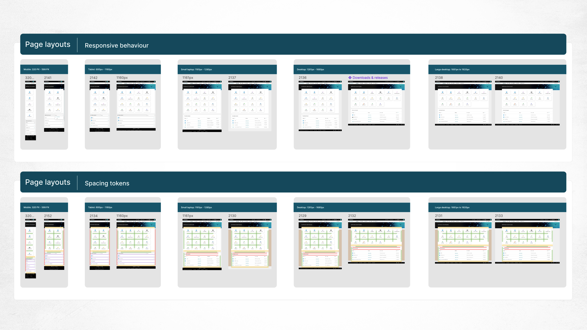
All of our designs are responsive, and we wanted them to behave consistently across our portals.We created a standard set of breakpoints from large desktop screens to laptops and tablets, down to mobile devices.
These patterns guarantee a seamless experience across all types of devices and meet accessibility requirements.
Framework design/development handoff
A great design is worthless if it is not implemented properly.
With that in mind, we created a template for development handoffs that clearly defines everything, from the responsive design to accessibility requirements, to clear patterns and visualizations of the spacing. We did not want developers to have to make design decisions by themselves or to be required to constantly ask our designers for clarification.
QA can use this as a reference too, when making sure designs and accessibility requirements have been implemented correctly.
Illustrations
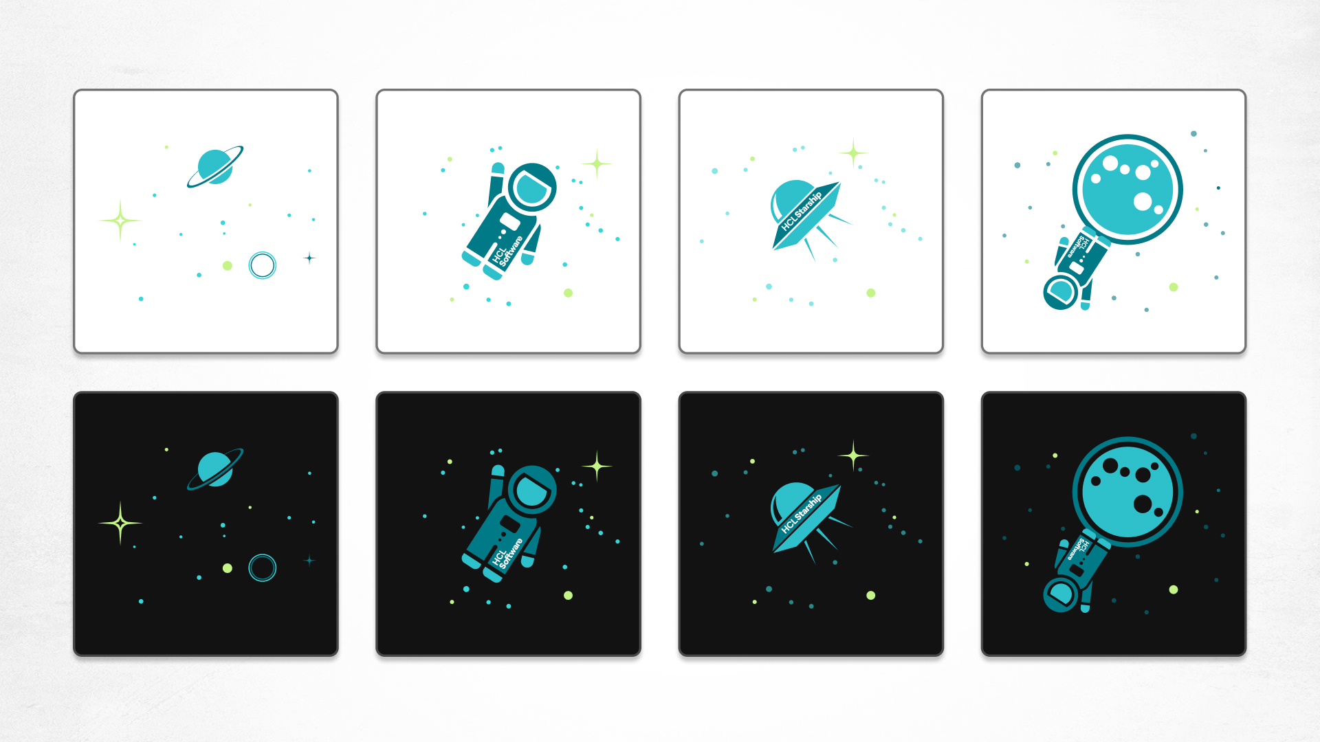
We added a little fun into our customer-facing platforms, which enterprise designers do not always have the opportunity to do.
Across our site (and even in this case study!) you can see the space-themed illustrations that we often use in feedback pages and other areas where they will add rather than distract from the experience. They can be animated, and work in light and dark mode.
Bringing it together
My HCLSoftware
Saved 2+ million USD via internally produced platforms
Increased user satisfaction from 3/7 to >6/7
40+ products over 5 categories
Marketplace
Target: increase online sales through SaaS/Self-Service
Reduced trial startup time from days/weeks to minutes